


Indians don’t like White Space
A paper on Indian typographical
practice and Education
A look at what and whether there is an Indian idiom in the field of typography and typography education.
As Indians we do not let white space be. We are uncomfortable with the slightest gaps between people, cars or words, we rush to fill silences with a clutter of conversation – our ramblings and layered communication could be considered manic. Ours is not a world with an economy of expression or distilling of thought into the singular or the absolute. The stereotype of not leaving the smallest gap in the personal spaces when we queue up seems to be similar to how we treat out typographical layouts.
This paper is a stance against a dominant Euro-centric graphic language. Swiss and European design principles continue to dominate typography and use of colour throughout the world, championing a reduced approach to typography, a strong grid and limited use of colour. Although these rules of Swiss ‘conduct’ were unwritten and unenforced, Swiss modernism was a style that circulated round the world through books and posters, feeding our Anglo-centric aspirations.
This paper is a stance against a dominant Euro-centric graphic language. Swiss and European design principles continue to dominate typography and use of colour throughout the world, championing a reduced approach to typography, a strong grid and limited use of colour. Although these rules of Swiss ‘conduct’ were unwritten and unenforced, Swiss modernism was a style that circulated round the world through books and posters, feeding our Anglo-centric aspirations.
The rather provocative title aside, this talk is part of a preliminary attempt to put together an account of professional typographical practice in India. Other than the few sporadic efforts to initiate critical discourse, design (and particularly typographic) practice remains driven by historical convention, and subjective, almost optimistic, intuition. The paper addresses whether there is an Indian idiom in the field of design and what that is; the search for an Indian way of thinking has been a persistent discourse in many other disciplines. To expand focus beyond the relatively narrow field of typography, this paper connects to larger ideas within communication and visual culture studies – correlating Indian design practice to art and philosophical movements across geographies and genres.

This paper was presented at the International Typo Day Conference in February 2016. Do contact sarita@hanno.in for details on the full paper and ongoing research.
Notes on Images
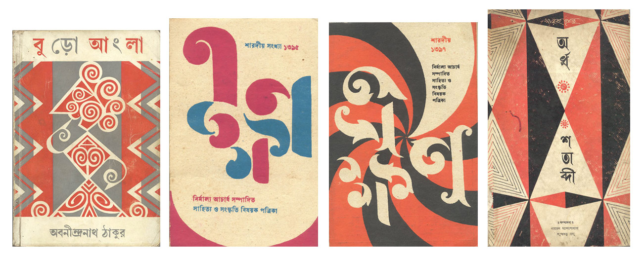
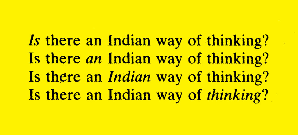
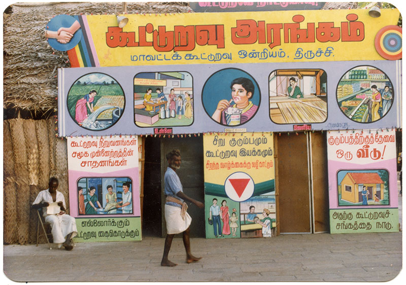
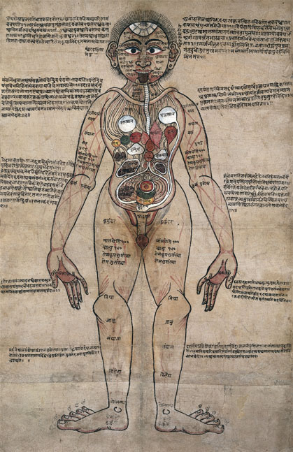
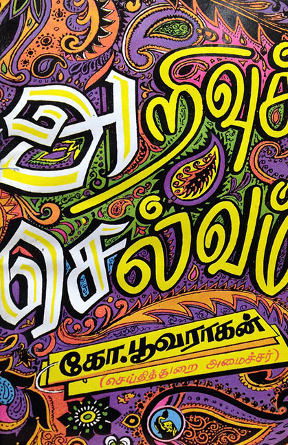
Satyajit Ray Book cover designs From the Satyajit Ray Film and Study Centre | Ayurveda man, Wellcome Images. | AK Ramanjuan’s sketch on an Indian way of thinking | Jain Manuscript page | A street in Tamil Nadu | Contemporary Tamil book cover.
While Satyajit Ray’s book cover designs show a fusion of a vernacular style with modern design language, the Tamil book cover seems to demonstrate that vernacular typographic styles seem to have evolved unfettered by any impositions by ‘modern’ design sensibilities.